Analyzing Fill the Blanks Charts
The Fill the Blanks Task type will produce accompanying charts and tables that are made accessible via the Charts summary overview. Like all Task charting outputs in Recollective, you can filter your results by Segment group or select Participants using the controls in the top right of your page.
Poll Blanks
The poll blank type in a Fill the Blanks Task will produce the same type of outputs as a Poll Task (or Prompt with multiple buttons). Please reference the article on analyzing Poll charts to learn more.
Chart
A single-choice polling blank will produce a pie chart that displays a breakdown of the choices participants made. For multi-select polling blanks, the displayed chart will be a horizontal bar chart by default but can be switched to vertical if desired.
Using the offered controls, you can change the Chart from its default type and choose to display the chart values as counts or percentages. There's also a dedicated Export option so that you can add the chart into a separate report.
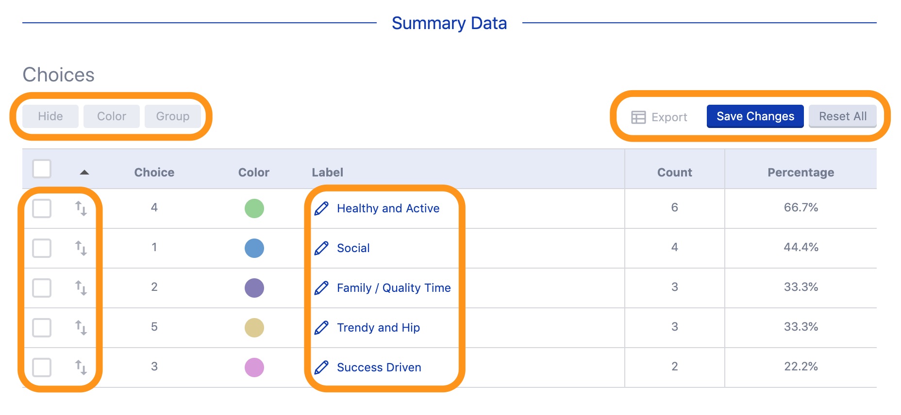
Summary Data Table and Chart Customization
Below the polling chart, you'll find a Summary Data table that allows you to customize aspects that will then be reflected in the above chart and can be saved as the default going forward. The table also provides the counts and percentages for each of the choices.
Response Data Table
You'll also have a
Response Data table at your disposal that provides a breakdown of each participant and their selected choice(s) among other information. The data from this table can be exported to CSV or in the
Quantitative Data Export format using the dedicated options in the bottom right.
Scale Blanks
The scale blank for this Task type will produce multiple charts and tables as outputs to aid in your analysis and reporting efforts.
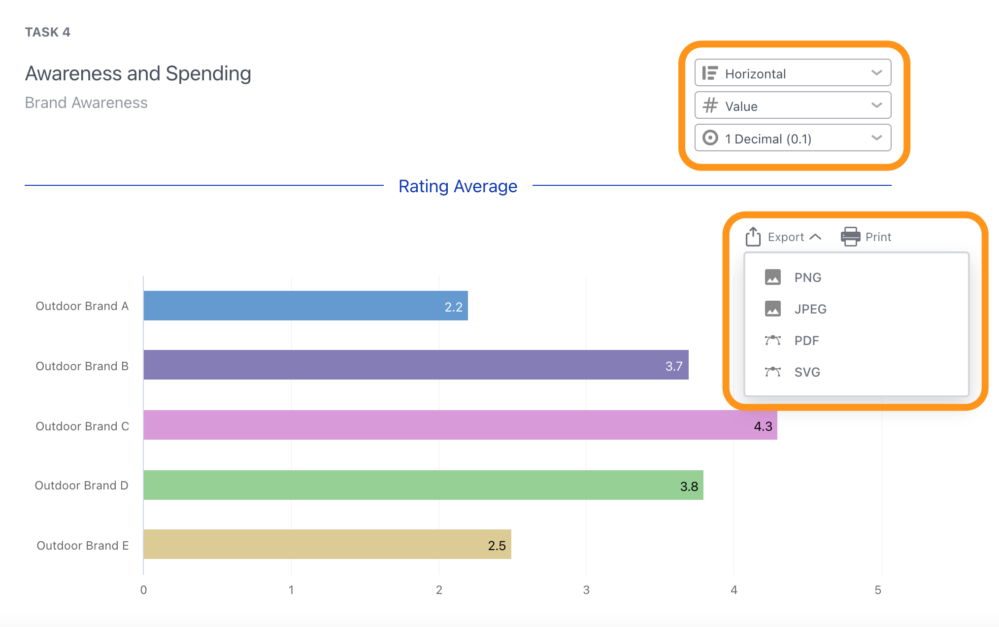
Rating Average Chart
The first chart will be a Rating Average bar graph displaying the averages for each of the scale's row elements. Using the offered controls, you can change the chart from its default horizontal type to vertical and choose to display the chart values as counts or percentages (same for the distribution chart). There's also a dedicated Export option so that you can export and add it to a separate report.
The rating averages are a reflection of your programmed scale. In most cases, you can order things from highest to lowest. If you've programmed your scale whereby a smaller number rating is a reflection of something positive however, you'll then want to order and reference the elements that have a lower average rating first
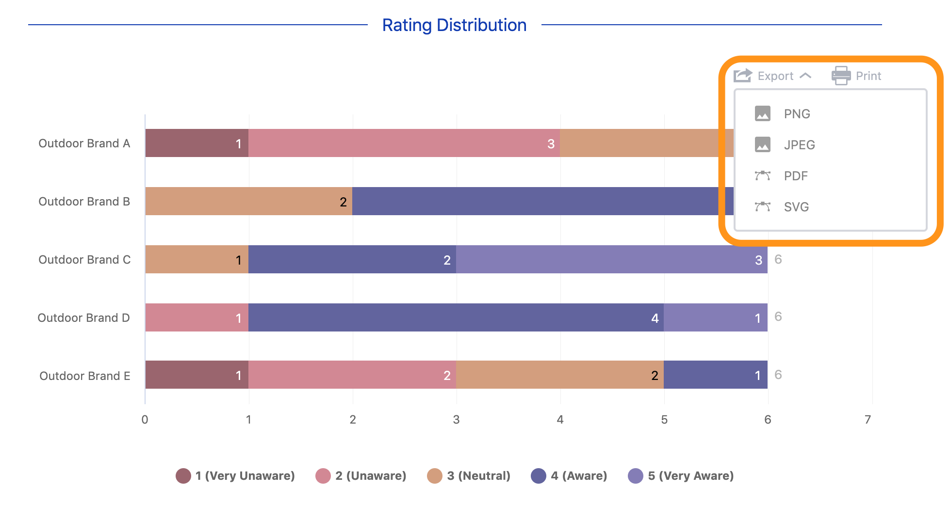
Rating Distribution Chart
The second chart will be a Rating Distribution stacked bar graph that provides the breakdown of ratings received. Using this feature allows you to not only have a single overall distribution chart but a specific distribution chart per rating. Finally, there's a dedicated Export option so that your various charts can be exported and added in your report.
Summary Data Tables and Chart Customization
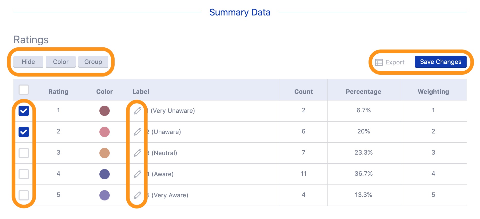
Below the Rating Distribution chart, you'll find Summary Data tables that allow you to customize aspects that will then be reflected in the above charts and can be saved as the defaults going forward. The first displayed table summarizes the Ratings and allows you to see a count, percentage and weighting value for each of the included items.
You can use the ratings checkboxes to select ones which can then be hidden, have their colour edited (the default colors will be the ones chosen in
Study Settings: Appearance) or grouped together (e.g. collapsed categories). You can also use the pencil icon to edit the label names if desired. Finally, you can use the
Save Changes button to commit any of your chart customizations as the default for others. The table data can also be exported using the dedicated option.
The second table summarizes the Items and allows you to see the count and percentage of each rating's selection as it pertains to each row element from your scale.
Similar to the Ratings table, you can use the item checkboxes to select the desired one(s) to Hide, change the Color of or Group together in the Rating Distribution chart. You can use the handle icons to change the order of the items and the pencil icon to edit the label name. Finally, you can use the Save Changes button to commit any of your chart customizations as the default for others. The table data can also be exported using the dedicated option.
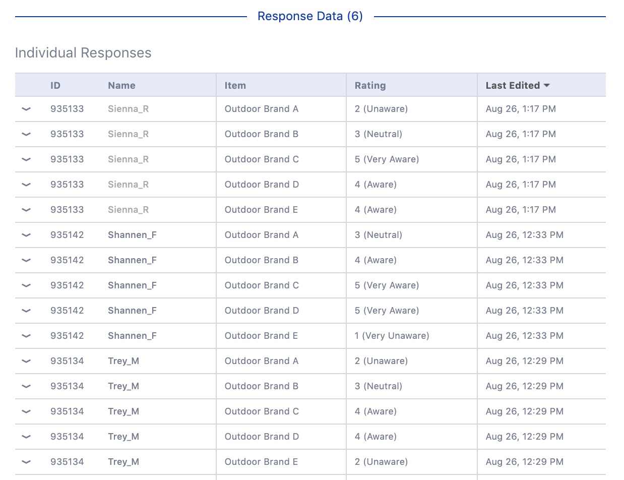
Response Data Table
Alongside the charts and tables referenced above, you'll also have a
Response Data table at your disposal. The
Individual Responses table will provide a breakdown of the participants, each row element from the scale and its received rating. The data from this table can be exported to CSV or in the
Quantitative Data Export format using the dedicated options in the bottom right.
Scale (Allocation) Blanks
The scale (allocation) blank for this Task type will also produce a chart and tables as outputs allowing you to delve into your data in more meaningful ways while online and prepare exports for deliverables.
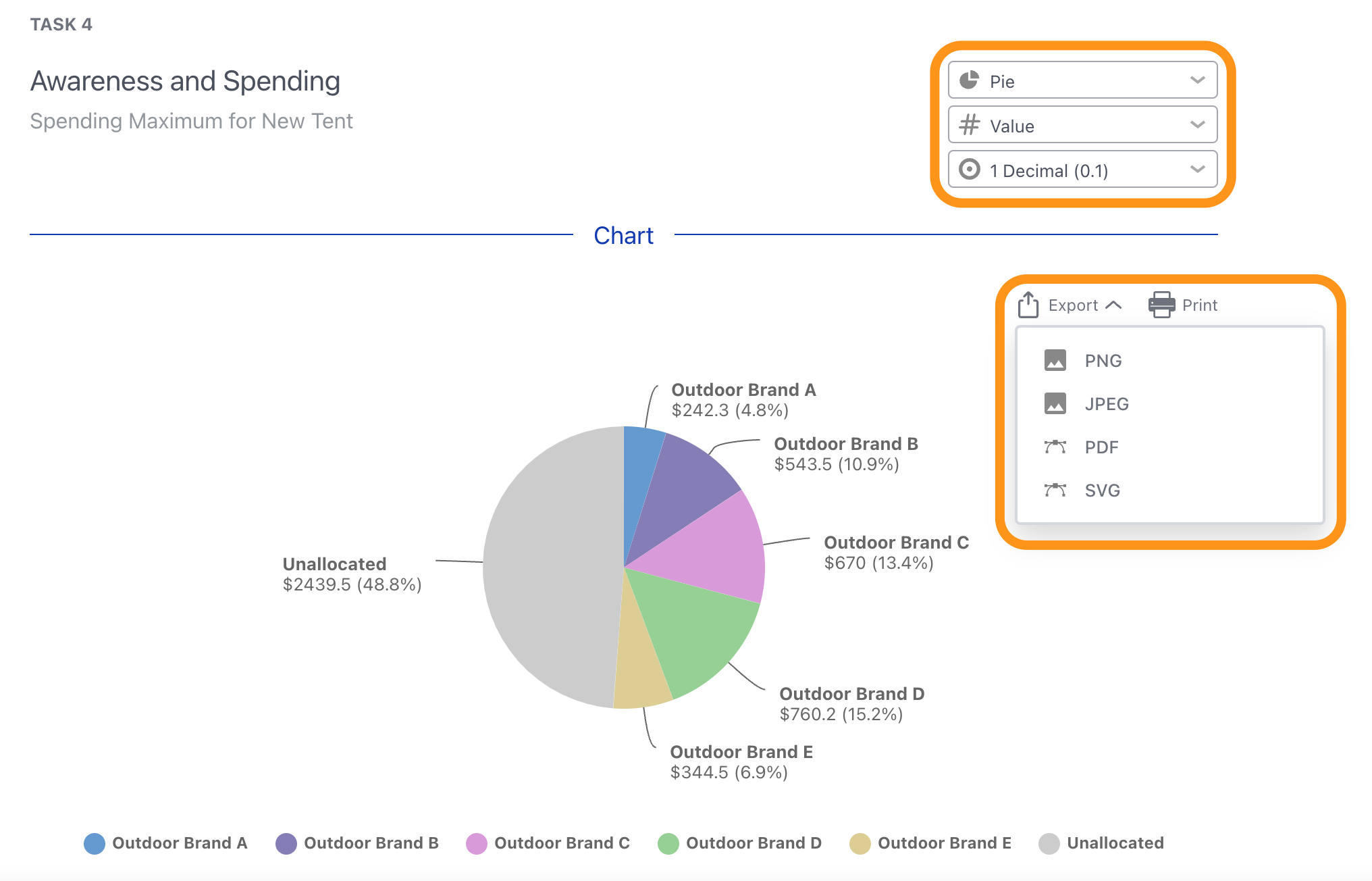
Chart
The Chart will breakdown the allocation of the different items the scale was composed of and will be a pie chart by default. Using the offered controls, you can change the chart from its default to a horizontal or vertical bar graph and choose to display the chart values as counts or percentages. Finally, there's a dedicated Export option in the top right.
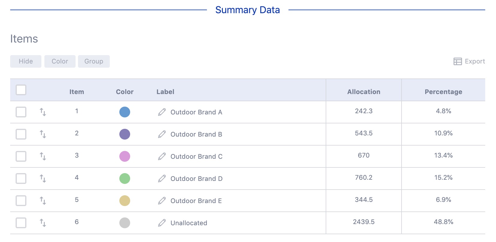
Summary Data Table and Chart Customization
Below the Chart, you'll find a Summary Data table that allows you to customize aspects that will then be reflected in the above chart and can be saved as the default going forward. The Items table summarizes the different items that your scale exercise was composed of and allows you to see an average allocation amount and percentage.
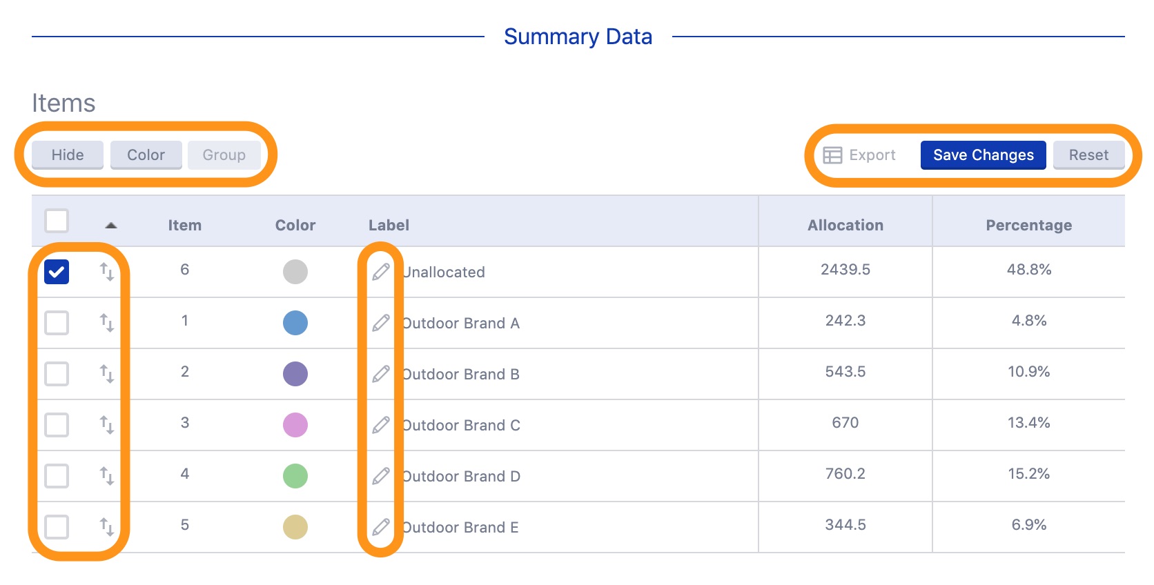
You can use the item checkboxes to select the desired one(s) to Hide, change the Color of or Group together in the related chart. You can use the handle icons to change the order of the items and the pencil icon to edit the label name. Using this feature allows you to not only have a single overall chart but more specific ones as well (e.g. where the unallocated amount is removed).Finally, you can use the Save Changes button that appears to commit any of your chart customizations as the default for others. The table data can also be exported using the dedicated option.
Response Data Table
You'll also have a
Response Data table at your disposal. This table provides a breakdown of each participant, item and their allocation amount and percentage. The data from this table can be exported to CSV or in the
Quantitative Data Export format using the dedicated options in the bottom right.

🗣️: Still have questions or want to leave feedback on how we can do better? Contact us at helpdesk@recollective.com.


